

Let's Get Acquainted With Contrast:
Applying Dair's Seven Principles
When we look at the front cover of a book we can most times tell right away what the title of it is. This is most likely because the designer of that cover has implemented one of Dair's seven principles of contrast to demonstrate the hierarchy and differentiation of type to their audience.
In Carl Dair’s book “Design With Type”, originally published in 1952, he covers seven principles for contrasting type: size, weight, form, structure, texture, color and direction.
Let’s look at a few examples of these seven principles in action.
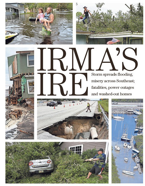
This front page of an article about Hurricane Irma utilizes a brown serif font to create contrast and define harmony between all the text on the page.
Harmony is established by the vast size difference between the main headline and the article’s deck.
The main title’s type doesn’t have a lot of weight, but its size is so much larger than the deck that the differentiation is obvious.
The form of the main title is also in all caps adding to its contrast.
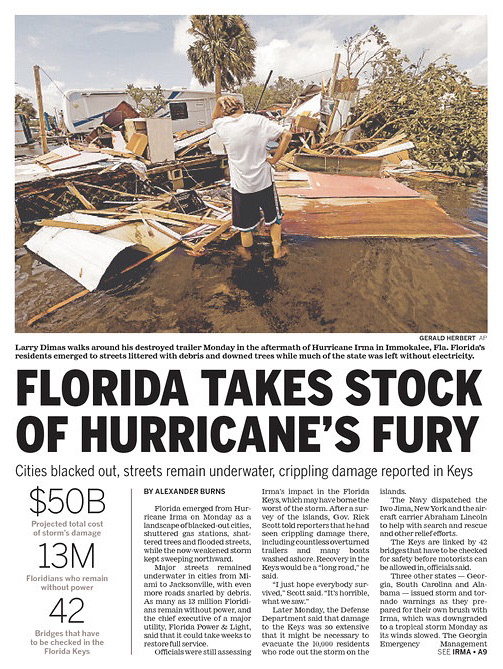
There is more texture present in this example of a different Hurricane Irma article.
We can see the multiple varying styles of text blocks. The main copy of the story is compiled into three columns with small type. The caption for the photo however is written with more weight to differentiate it from the copy.
The statistics on the left of the Florida example also stand out because of the numbers’ size and the use of color for each statistic's explanation.
This example also uses black font color with an intermingling of different serif and sans serif fonts that look nice together and establish a hierarchy.

In this final example of Brené Brown’s book ‘Daring Greatly’, we see usage of almost all of Dair’s principles.
The first and, I think, the most obvious form of contrast present on this book cover is the directional shift of the main title.
The size, coloring, and all caps form of the main title also draw our attention instantly and it is clear it is the first thing our eyes should go to.
Simple, sans-serif white text is used to create harmony, but weight, form and size are all used to formulate contrast between the extra information included on the right side of the cover.
Brené Brown’s name is enlargened and given extra weight to establish it is the most important text in the group. Then as the size and weight of the text decreases, so does its importance.
Defining Dair’s seven principles of contrast in design examples such as these bring to light just how often they’re used in everyday life to create differentiation and hierarchy between groups of text and just how valuable they are for designers to keep in their back pocket.