Exploring Courier:
The Classic Yet Quirky Typeface
We see and use fonts like Comic Sans, Arial, and Futura countless times throughout our day to day life on billboards, and street signs, and newspapers, but how often is it that we take the time to understand the origins of such integral parts of design culture?
I took the time to research one of my favorite classic fonts; Courier, and here's what I found.
Courier was originally designed in 1955 by Howard Kettler, but later copied by IBM’s Adrian Frutiger to be used for their typewriters (the company didn’t initially secure rights to the typeface and had to weave around that by doing this). However, Courier is now the standard typeface for typewriters because of this debacle, and was used for IBM’s famous Selectric typewriters.
Before "Courier", the typeface was initially called “Messenger”, nodding to its pragmatic functions. Here’s what Howard Kettler had to say about the two names.
“A letter can be just an ordinary messenger, or it can be the courier, which radiates dignity, prestige, and stability.”
You may also know the typeface by its Windows 3.1 name, “Courier New”, which is an alternate version of the font designed later by Monotype.
Fun Fact:
Hollywood screenplays are often written in 12 point Courier.
Courier falls into the mono-spaced font family, meaning that all of its characters have the same width. Courier is a serif font, as you can tell by the letters to the right. The h and p have divots coming from their ends, making the font serif.
The font’s ascenders and descenders don't extend very far in comparison to the length of Courier’s x-height, giving the typeface a stout appearance.
The bowls of Courier are variably widened to accomplish the set mono-space width in each letter.
Because of its mono-spaced-ness, Courier is most commonly used when a designer wants to insinuate the look of a typewriter. I personally think it has a vintage feel, most definitely because of this type-writer connection.
If Courier were a person, I think they would be an artsy librarian who wears colored hats and brown lipstick.
I think that today, using the typeface comes with a quirky connotation because what is trendy is sleek and modern, not serif and vintage.
I think the typeface matches well with my personal brand too, which can be defined as raw, earthy, or rustic.
I like to pair this typeface with the Providence family, as seen on this site (even though this font is not exactly Courier, but a similar match), because I enjoy the duality of a childish typeface alongside one that is firmer, yet still lighthearted.
I encourage readers to take the time to look into a typeface, or any design element anytime they see often in the world around them, and it piques their interest. Understand the roots of design is like opens our eyes to just how complex even something so small as the typeface on a billboard really is.
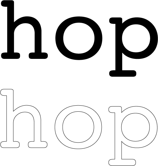
Matthew Carter, a well-known typographer suggests that the three lowercase letters h, o, and p can reveal much of the “DNA” of a typeface.