Typeface Poster: A Case Study
"I believe that to exemplify the essence of an inanimate thing is the heart of design."
Given a choice of a few classic typefaces, I was assigned in class to choose one, delve into its history, and create a poster exemplifying its essence.
Naturally, I chose Courier because it is my go to “classic” font. I think Courier has more personality to it than fonts like Arial or Gil Sans. Courier is stylistic, and has something to say.
The first step I took was research. I had to gain some context on the typeface to better understand its origins and depict it wholly in my poster. I learned useful things like how Courier was actually copied by a designer from IBM to be used for their typewriters since they didn’t secure the original rights.
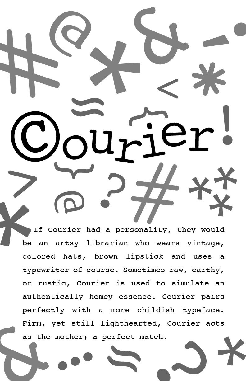
Information such as this was useful to me when our professor added a limitation to what we could include in our poster. We were to brainstorm ideas that included a glyph as the poster’s focal point. I instantly thought of incorporating the copyright symbol. It was perfect since Courier even starts with a C.

An element pulled from a design solution that could be a logo for Courier!
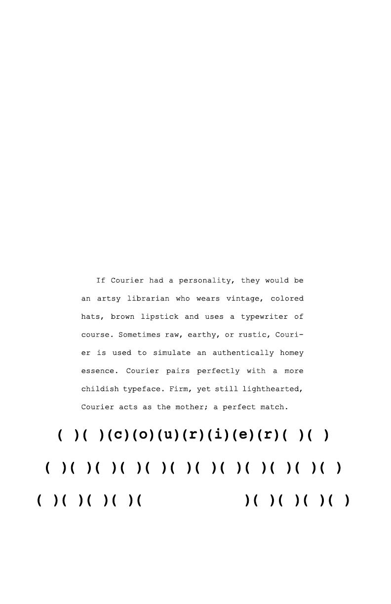
In this brainstorm phase, I started out by studying the copyright symbol and other glyphs that I felt represented the typeface well. I sketched out each symbol to get a closer look at them and think up creative solutions they offered for making the poster. For instance, I thought about using the lowercase i from the typeface flipped on its side as the paper coming out of a typewriter.
Our professor then asked us to sketch out 8 different possible solutions, some of which were to have focal points of the copy, some of a glyph, and some of the typeface’s name. This challenged me to not get too focused on a single idea right off the bat. Formulating vastly different sketches and ideas always varies from my instinctual method to focus on just one and edit it to perfection.
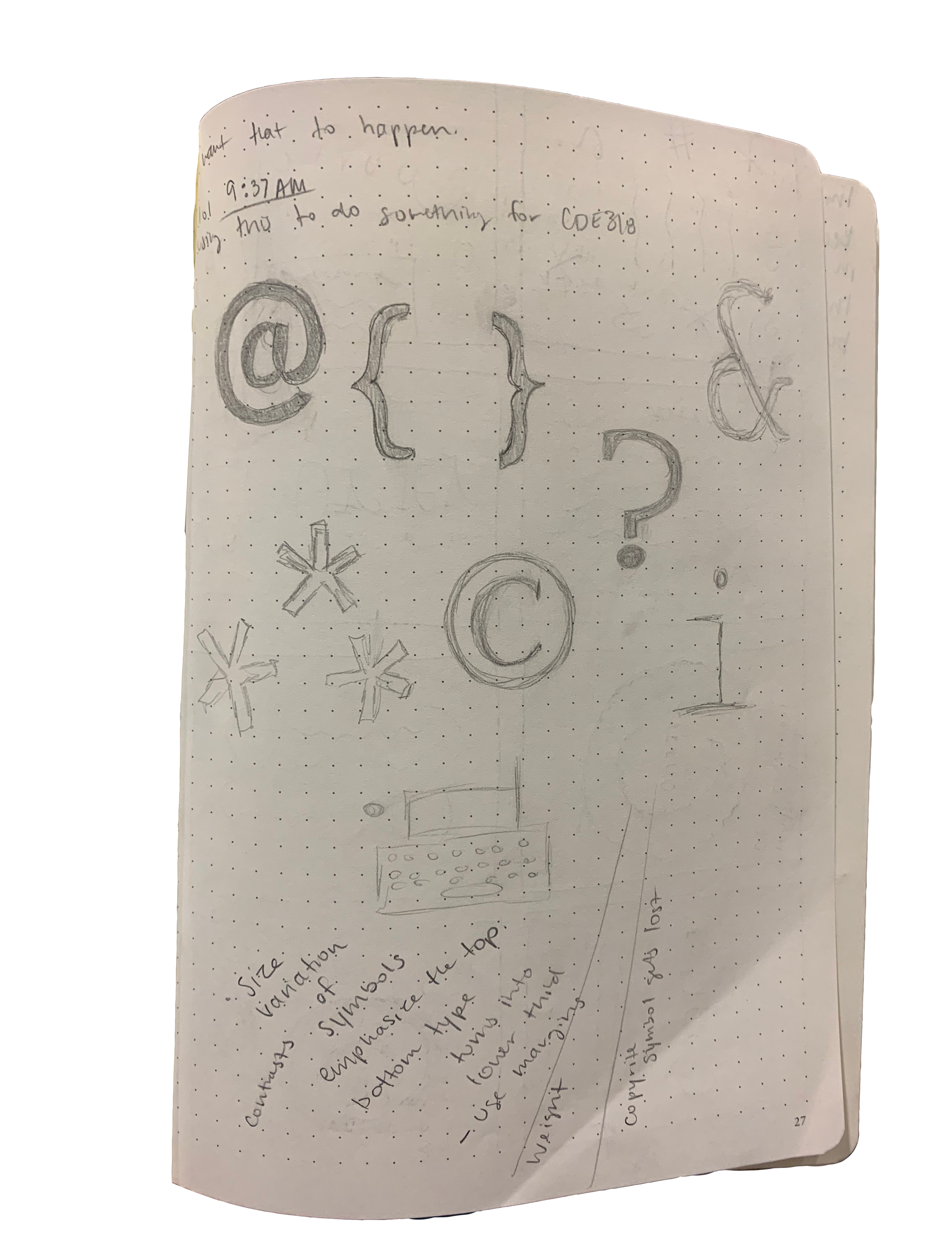
Primary sketches of glyphs
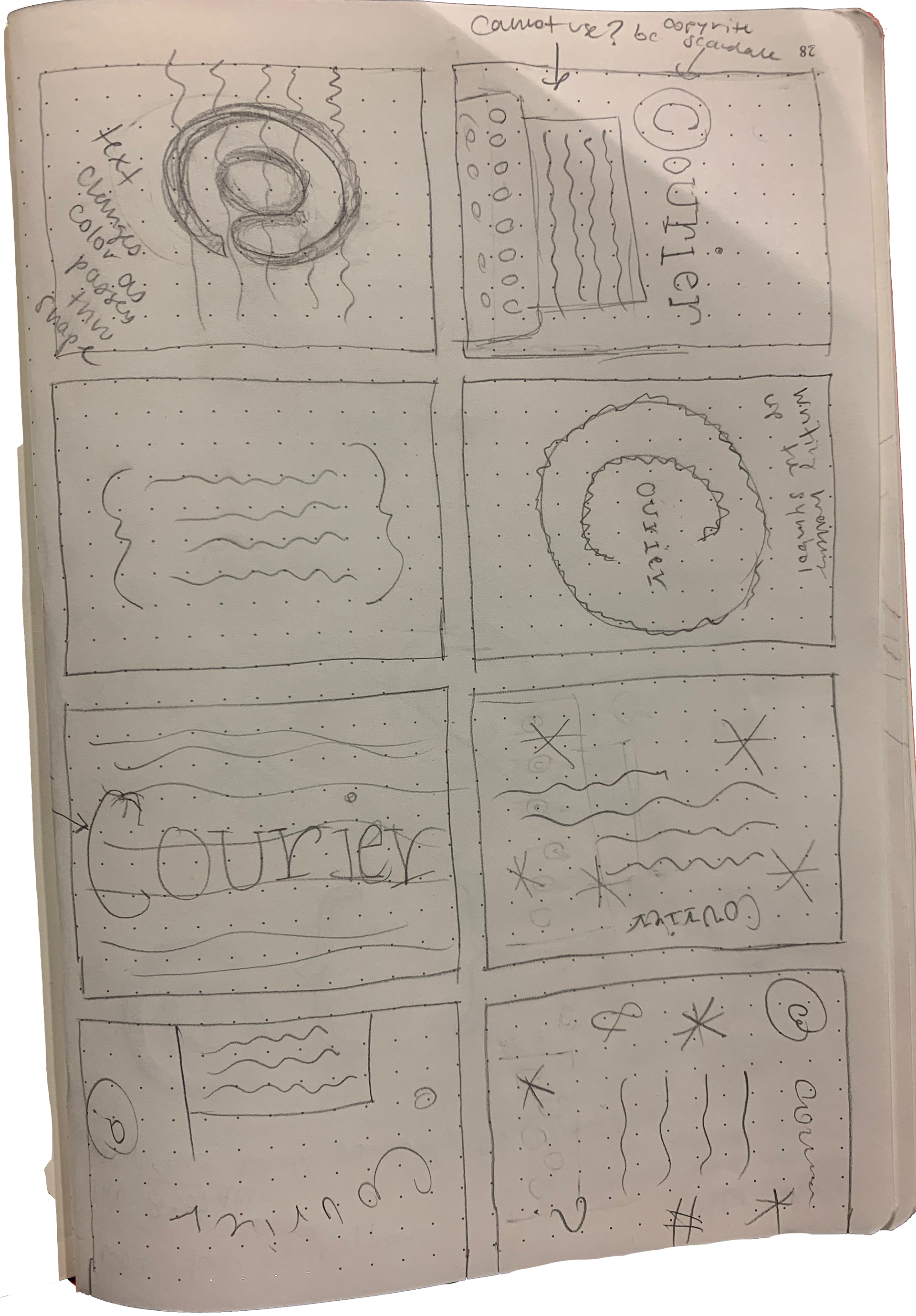
8 possible solutions
1st Prototype
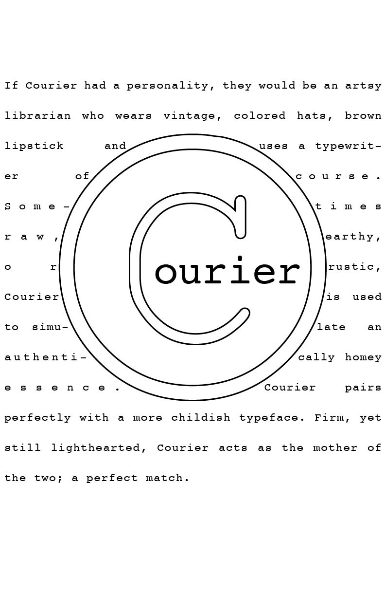
2nd Prototype
3rd Prototype
After getting critiques on and talking through some of these sketches with my professor, I then moved on to a mock-up stage and presented 3 possible poster designs to our class, each of which focused on a different element of the poster. This approach again challenged me to not be tunnel visioned on one single design. Instead, I had to keep two other designs in the works and put just as much effort into spiffing them up.
If I had skipped this step I wouldn’t have practiced exploring the other creative solutions that I actually ended up loving. This was also a useful step, because when I am faced with actually making designs for a client it will be good to have practiced making multiple ideas for the client to choose from.
These three mock-ups were then critiqued by my classmates and I chose one to move on with. I made my choice based on which poster had the most personality and was the most entertaining to look at, as well as which poster my classmates liked the most.
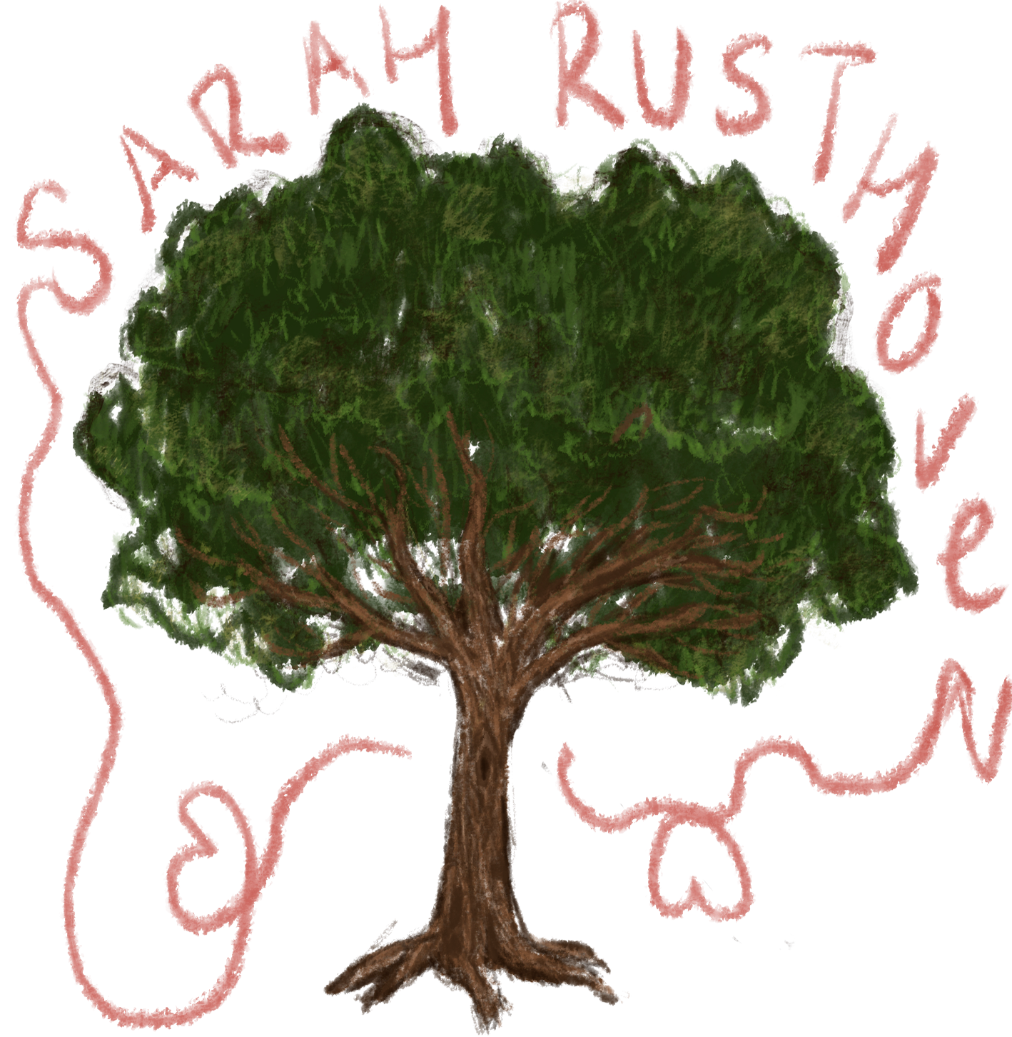
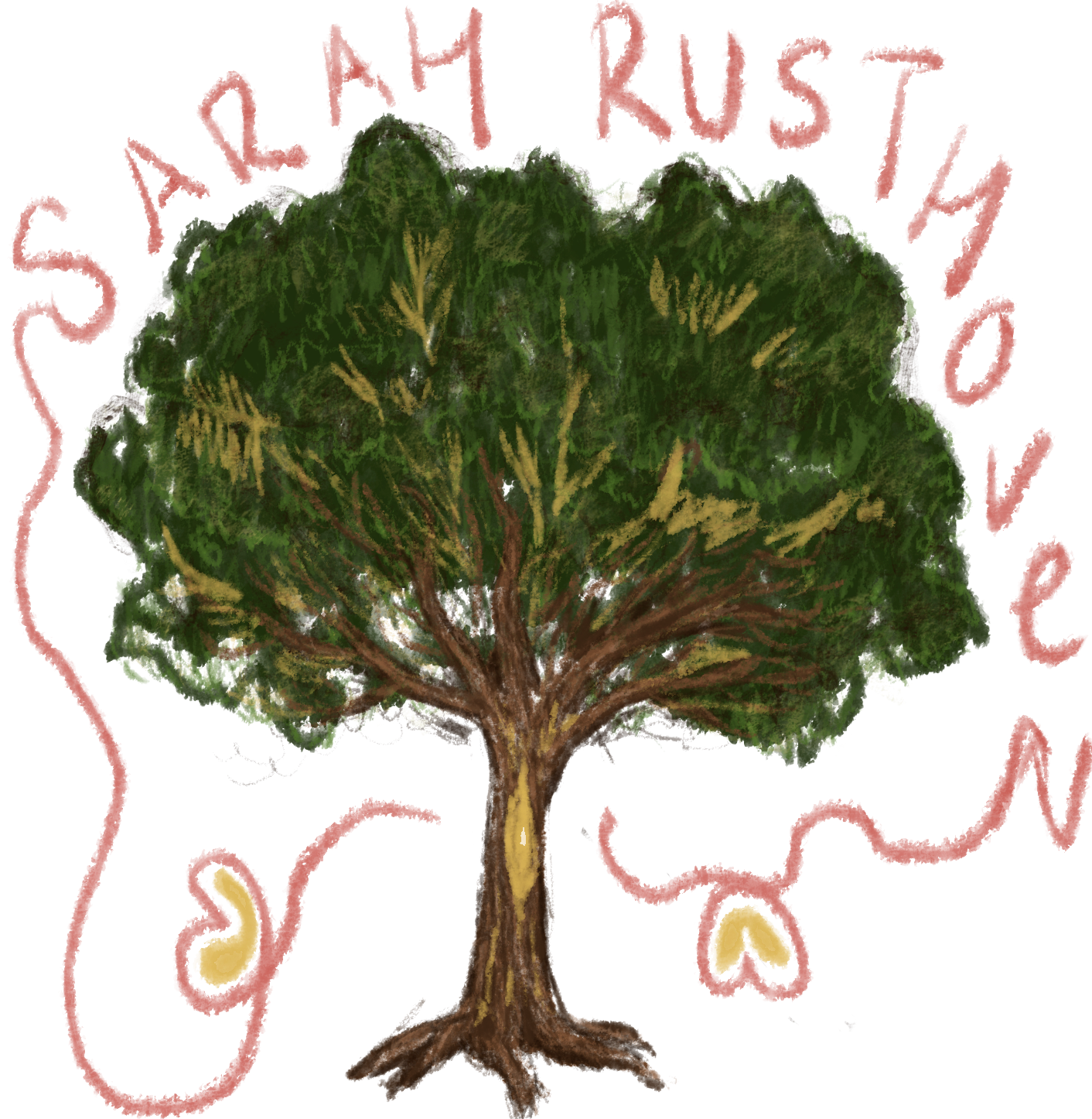
With the final design I added color and played around with some positioning of the glyphs.
This design exemplified the essence of Courier to me because I feel like Courier is the quirky and fun aunt of the classic typeface family. Having the glyphs all scattered around played to this notion. I went with earthy vintage-esk colors as well to nod to the old-timey typewriter vibe.
I enjoyed this assignment because I got to make a visual representation of something seemingly lacking personality. Essentially, I got to be a designer!
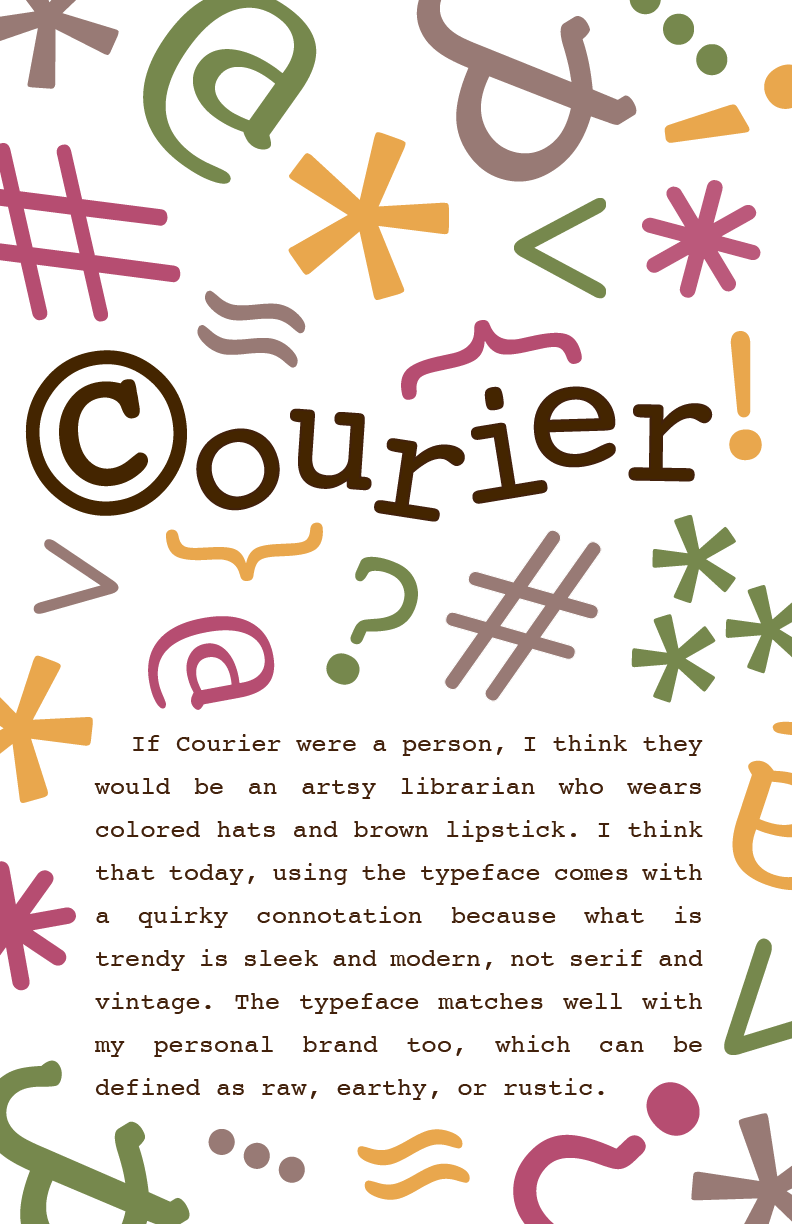
Final Poster